Travels and Encounters (extension)
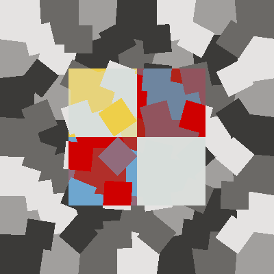
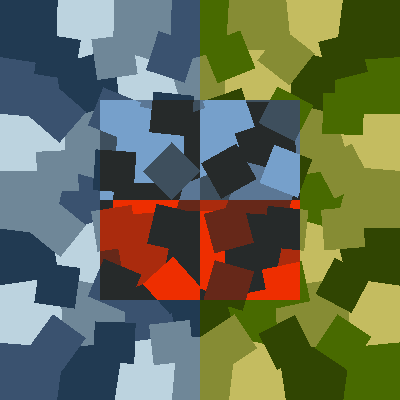
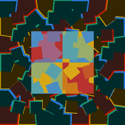
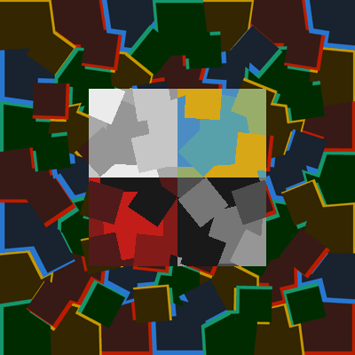
The paintings of the series Synesthesia were just little 4-colours motifs. Four of these were juxtaposed for the compositions of The Republic of Colours. I now want to try to reintroduce in the play or colours, besides the synesthetic figuration, the more traditional devices of chromatic formalism and naturalism. I take two names with four colours, and for each of the quarters, combine their hues in variable quantities. Some areas are entirely the colour of name_1, others a mixture of 2/3 name_1 and 1/3 name_2, others 1/3 name_1 and 2/3 name_2, and the rest the colour of name_2. These areas of varying titration are distributed according to the chaotic motifs I already used for the 'camouflage' backgrounds. The process starts with such a chaotic image in four greys. Then each of the grays is replaced by a mixture of colours proportional to its density. For instance, the combination of the names (in French) of Hérodote(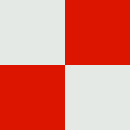 ) and Thucydide (
 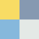 ), the founding fathers of history, will give :
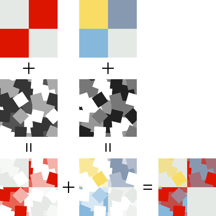
The chaotic drawing which serves as a key of repartition of the coloured names will be used for the background around the central motif. It is there modified in a way that gives colours a figurative value, in this case for instance the achromacity of classical sculpture and architecture, with a shade of marble.
How do I choose the two names to blend ? The reason could be a proximity in history, or in any domain of culture; or it could be nothing reasonable and only a formal relationship of the colours of the names.
Nestor Burma at the Côte d'Azur
It is an aesthetic criterion which led me to investigate the association of
|
|
|
The colours of those two names are almost perfectly symmetrical, which lets me hope for a balanced result of their combination. The four colours of each name two by two produce 16 hues :
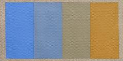
The size of the painting is such that the central motif were the names are combined has the same size as the mono-name paintings of the synesthesia series. The background is a figuration of what 'Côte d'Azur' could mean for painters and poets (Cézanne and Valéry, in my hazy recollections). The horizontal division makes it a representation of a spatial event, a landscape.

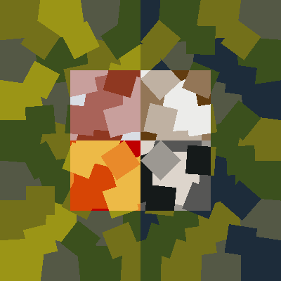
Nestor Burma à la Côte d'Azur 1.
Acrylic on linen 80x80cm, June 2002.
A second version of the same idea accentuates the figurative reference of the background with a rudiment of perspective : the dimension of the modules for the upper part is smaller , which gives it a relative effect of recess.

Nestor Burma à la Côte d'Azur 2.
Acrylic on linen 80x80cm. July 2002.
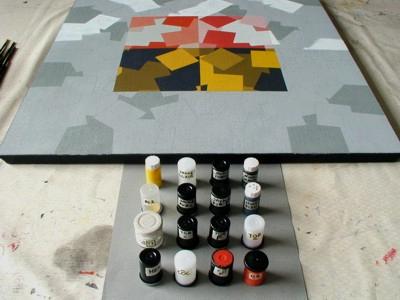
Between the idea of the painting and its realization, constructivist art installs a time for thought. There is here a distrust for the seductive effects of gestures and textures, chance and confusion much appreciated by the practitioners of expressionism. In my approach as I depicted it supra, drawing and coloring are not on a par in this voluntary temporizing : the drawing is determined as I begin the canvas, but the colour will reach its definitive state only after
minute trials and errors on the canvas itself.
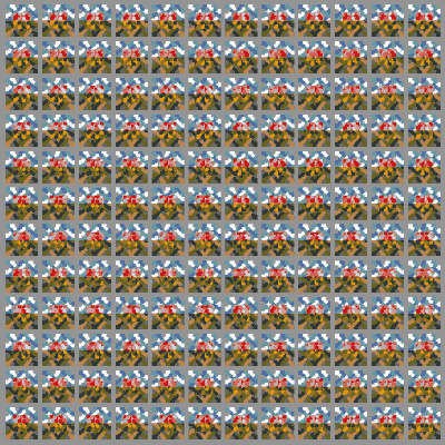
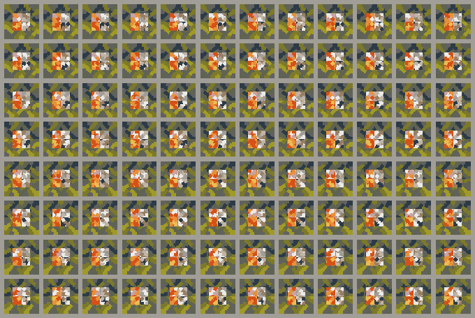
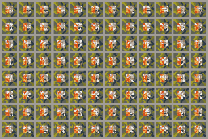
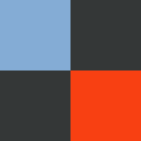
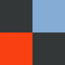
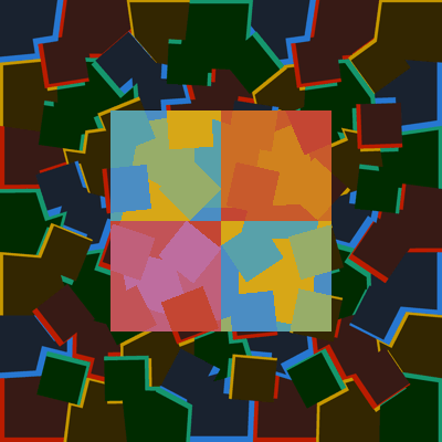
However the colour scheme has been prepared through the computer creation of digital models of the painting. Typically the combination of two names will produce, once the drawing is fixed, 576 variants for the colouring. The display of those, for evaluation and selection, would be done by succession in time or juxtaposition in space. Here is an example of spatial array, 144 possibilities of NBCA ("Nestor Burma" and "Côte d'Azur") among which was chosen the image that stands here above:
The evaluation may also happen on digital images that never leave the computer, where I arrange them in more or less rational succession. Either the background changes, or the figure, or both :
Static arrays of variations are also examined in the Matrices d'Esquisses section.
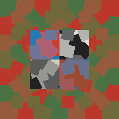
Hernan Cortès and Montezuma
A new proposal for a combination of names is based on a historical connexion, which does not presume the aesthetic success of the operation. In the night of the 30 June 1520 -called there Noche Triste-, the Aztec people revolted against Montezuma ( ) and his allied Hernan Cortès (
 ), killing the first and forcing the latter to flee trough the jungle.
The background here is divides in two parts, the jungle and the night. I tried 96 variants with different drawings and colours.
96 Noches tristes. The Jungle. Cibachrome 120x80cm. August 2002.
The parting of the image with an horizontal line is an elementary gesture of landscape figuration. A vertical division means a narrative figuration principle.
96 Noches tristes. The Flight. Cibachrome 120x80cm. August 2002.
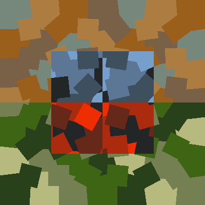
The configuration chosen for the painting is one of those 96 vertically divided backgrounds :
Hernan Cortes and Montezuma. Noche Triste.
Acrylic on linen 80x80cm. August 2002.
As before, the variations can be graded along time :
Frida Kahlo in Arizona.
We stay in Mexico. I like Frida Kahlo (the name) because it has simple and nice colours. It is symmetrical with Arizona, for example.
|
|
|
For the painting, I just placed the names on a background which superposes chromatic renditions of Mexico and Arizona as they are on a map.
Frida Kahlo in Arizona.
Acrylic on linen 80x80cm. February 2003.
Frida Kahlo in the mirror.
We can see in Frida Kahlo's paintings a recurrent compositional device which consists in contrasting two vertical halves as good and evil, past and present, Mexico and USA, etc. There is often also the opposition of her figure to its double in the mirror. A new version of the theme of Frida Kahlo combines her name with itself in the mirror (which happens to be very much like "Arizona". The background opposes the cold blues of the night with the warm green of the garden in Coyoacan.
Frida Kahlo in the Mirror.
Acrylic on linen 80x80cm., march 2003.
The variations arranged as animations :
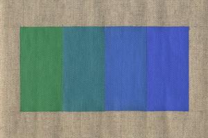
Edith Piaf and Miles Davis.
Now another two almost symmetrical names with some cultural connexion :
|
|
|
The background, again, is a matter of figuration. One can think of a musical mood called "blues" possibly associated with both musicians. There is no synesthesia here, but a commonly shared and conventional cultural connotation. It is just for me a gradation of intensity and brightness of blues, with a subtle shift in hue.
For this painting I produced a panel of 576 variations which is like a scenography of the process :
576 duos of 'Edith Piaf' and 'Miles Davis'.
Cibachrome 240x240cm, february 2004.
One of these variants, which answers the intimate name EPMDs2wfck+sur2301mod became a painting:

'Edith Piaf' and 'Miles Davis', n°1.
Acrylic on linen 80x80cm, december 2002.
After this first painting, I still had the desire to paint those beautiful blues, so I made a new one based on the runner-up in the beauty pageant of preliminary sketches (I called it PMDQs2Cr0wfck+sur2301mod) :

Encounter of 'Edith Piaf' and 'Miles Davis', n°2.
Acrylic on linen 80x80cm, january 2003.
The animated contestants :
Marcel Duchamp / Jacques Villon.
There were two painters, two brothers, who made a double portrait of themselves playing chess :
|
|
|
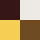
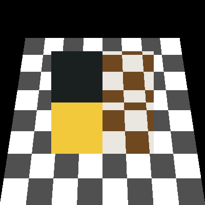
I represent them here in the usual manner, but taking here as a motif for the background a chessboard. This is a painting which like Ellsworth Kelly's Sixty Four Panels: Colors for a Large Wall is driven by a desire for impersonality and a distrust of aesthetic effects. The strategy here is not chance, but a principle of paradoxical imitation -neither naturalistic nor convential- of synesthetic peception.
Marcel Duchamp / Jacques Villon.
Acrylics on linen 80cmx80cm. September 2002.
Marcel Duchamp / Marchand du Sel
Being attentive, in an precise and impersonal way, to some apparently irrational phenomenon of my mental world, I could not not feel sympathy for the classics of the genre, Paul Valéry and his Monsieur Teste, and Marcel Duchamp. They seem to me to be typical of a very stimulating classical conciliation of reason and .
I choose to pair the name Marcel Duchamp with one of Duchamp's aliases as a punster, Marchand du Sel :
|
|
|
A calembour is a sort of incomplete symmetry, which of course is kept when transposed in colours.
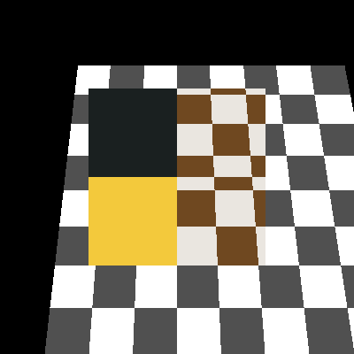
In the case of Marcel Duchamp, a chess-board pattern seems most appropriate for the background. One variant builds the pattern in perspective. In another I try to transpose the checker-pattern in the chaotic geometry which I elaborated for the Camouflages.
Here are three animations of variants. No painting was made from those.
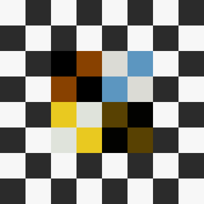
For the surrealists, the revolution in art did not necessarily entail the subversion of perspective. Marcel Duchamp was very adept at it and did not shirk the careful retinian account of his n-dimensional concepts. Thus I took for my matrix of colours and background the motif of the chess-board, intending it as a carefully constructed perspective and an exact rendition of the game. A specialist assured me that players lay the board with a black square in the lower right corner. The result :
Marcel Duchamp /Marchand du Sel. The False.
(Not realized)
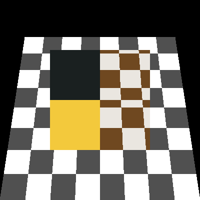
When the painting was done, I felt a doubt, and checking with more trustworthy information, I discovered that my board was faulty : the lower right square should have been white. I did not desire to throw the painting right away to the thrash, and so looked for a way to convert it into the rightful figuration of the regular disposition. The simple solution was to shift the cases one row left or right. So I got a true figuration, but at the price of symmetry.
Marcel Duchamp /Marchand du Sel. The True.
Acrylic on linen 80x80cm. October 2002.
This being done, I still missed the symmetry and accuracy of the original idea, so I made a new painting which would indeed be both nice and right :
Marcel Duchamp /Marchand du Sel. The Beautiful.
Acrylic on linen 80x80cm. November 2002.
Doctor Jekyll and Mister Hyde are good candidates to the of the illustration of the symmetries of self and double. There is strictly no happy coïncidence between the colours of the names, so I did exploit them by transferring the symmetry to the background. There was some finnagling with the outlines, since I wanted the symetry to reign on the background, but not on the names, which, at the textual level, cannot be concerned with symmetry.

'Docteur Jekyll' and 'Mister Hyde'.
Acrylic on linen 80x80cm, october 2003.
Le Bonheur des Amants.
You cannot practice hard-edge technique without some thought for the painters who taught the West how art could live without modelé or chiaroscuro : the japanese painters of the variably erotic prints called Ukiyo-e. The two names I want to combine nowe are the names of two landmarks of the most brilliant era of Japanese print,
|
|
|
Hishikawa Moronobu (1618-1684) was the first to publish his work as separate sheets. One of his representation of amorous intimacy is called The Bliss of Lovers.

Moronobu, "The Bliss of Lovers", detail.
From this image I abstract the four colours of the upper half of the background :

Kitagawa Utamaro (1753-1806) was the perfection of drawing and colouring.

Utamaro, Collage of details.
His backgroungs are often ochre or gray, and he was a virtuoso of the art of kirazuri, black ink mixed with tiny flecks of mica. The four tints of his half-background shall be :

After having, like for other paintings, produced 576 drafts corresponding to the 13 colours of names and backgrounds, I choose this variant for realization :

'Le Bonheur des Amants'.
Acrylic on linen on board 80cmx80cm. May 2004.
L'Objet sans Nom.
In this painting the subject is the background. It starts with a desire to work out the transition from green to blue, and this in my game can only be done for the background where aesthetic judgments on colour are admissible, whereas the colours of the figures are rigidly determined by synaesthetic associations.
This transition from green to blue, like the transition from red to green, poses no outstanding and real metaphysical challenge; but still it is worth some thought. It is a trajectory in a space of colours, and neither the structure of the colour solid nor the line representing the transition are straightforward.
My personal option is to see the space of colours as a republic where no individual is worth more than any other.I distrust deeply the hierarchies thrust on us by the ideologues of colour, who for example in a modernist spirit exalt the "colour out of the tube" or, more recently, want to reduce colour to the name denotating it -in a logocentric culture which actually loathes colour.
It is said that between green and blue some perceptual relations are more or less natural or automatic (blue recedes, it is darker, etc.); These phenomena may be caused by singularities of perception or contingencies of pigment fabrication; none of those reasons should prevent us from establishing our true relations between colours.
I tried to determine a set of four tints between green and blue where each colour would be as light and saturated as the others, where differences would be equal, and which would keep the painting flat. Besides, this should stay true under the bright light of day, or in the bluish glow of the small hours, or under the neon lights of the studio.
A wide reordering of my knowledge of colours was indicated, but I will not say more about that here. So here are a few of the image encountered on the way.
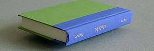
What spins in our heads we promptly meet at the next street corner. Havin just acquired an essay by philosopher John Searle, I discovered, under the dust jacket -predictably adorned with a Magritte picture, this conjunction of green and blue, with the resplendent golden word "Mind" !
The quest for the right tints cannot be done systematicaly with figures like the ones given by the red-green-blue digital model. It has to be done on the canvas with real paints. The scale is important too . The first strokes gave me an aerial view of tropical jungle islands lined with white beaches.
No systematic representation with the figures of the red-green-blue digital model can be of much help. But occasional detours through photographic and digital reduction may suggest rough approximations and corrections.
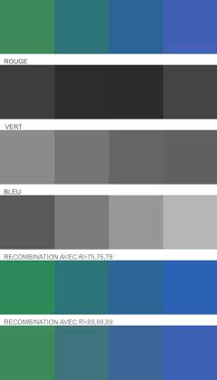
In the end I settle for a four-colour chord which represents an acceptable compromise between the aims I gave myself at the start, and which may not be completely compatible; (the images you contemplate now are of course gross approximations, able to give just the idea of what is intended).
All this meditating about green and blue made me think of Nelson Goodman, and of his metaphysical riddle illustrated by colours between green and blue and called bleen and grue. He is the one (or at least his name is) I will install in my verdant landscape, and, without bothering for exact denotations, I give this self-proclaimed nominalist the company of some Nameless Object, or at least of its (french) name : Objet sans Nom. The central figure of my composition thus becomes of the colours of these two "names" :
|
|
|
My figurations of coloured names are no hagiographic representations, and this is no exception. One should not see here the expression of a special veneration for Goddman's thought.Mes figurations de couleurs de noms ne sont pas des représentations hagiographiques, et celle-ci ne fait pas exception. On aurait tort d'y voir l'expression d'une vénération particulière pour la pensée de Goodman. To keep this clear I put in the title only the Objet sans Nom.

'L'Objet sans Nom'.
Acrylic on linen on board 80cmx80cm. February 2005.
Selfportrait as Galbinus Gilvus Cesius
With this transition from green to blue begins a series of paintings whose theme is a materialistic theory of colour, trichromatism as opposed to the subjectivist and dualistic aberrations issued from Goethe or Hering.
In the Voyages et Rencontres compositions, figure and ground are distinguished by their figurative status : the central figure is a synesthaetic transposition of a litteral reality, which then becomes the title; the ground is a naturalsitic figuration -with the constrained means of colour only- of somme concrete reality.
The natural phenomenon the painting is about is couleur. The divergence between the dualist theories and trichromatisme is nowhere more manifest than in the question of complementaries.
Red-green and blue-yellow are two formulations of complementarity.
Let us begin with a painted rendering of the transition from blue to yellow, and let us see what thruth a painting composed on such a motif can teach us.
Le blue and yellow are complementaries, and, far from producing green trough their mixing, transorm into each other through grey :
Now the chosen hues here are not exactly the real primaries of thrichromatism, (the blue opposite to yellow being more violet), but I just represent here the ordinary conventions :
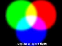
Additive colour mixing.The Colour Group.
But, as opposed to such representations, I wanted, as a painter, not to submit passively to the inequal luminosities of yellows and blues as they issue from the tube, and I thus assumed the hypothesis of a difference of hue only, raising yellow and blue at the same level of perceived luminosity and saturation : the blue is served pure -with even an addition of white- and the yellow is downed as much as possible while staying a yellow. I clearly position myself here against a naive essentialism which says a colour can only be what the word "yellow" spontaneously evoques.
A continuous transition between these two colours would pass through an achromatic (grey) neutral point of the same value, but as we want to make a four colours chord, this neutral point is absent and we intercalate a yellow grey and a blue-grey.
Now we have a painted transition which conforms to materialism and not subjectivism. Can we say that such an act is per se more materialistic than what we would do while passively reconducting the dominant ideology in matters of colour ? I do think so.
As for the central figure, what is represented is some literal phenomenon -words-, apprehended in its synaesthetic dimension. No scientific inspiration here, but stil a desire of lucidity in my dealings with individual subjectivity. Wantig to give miself as a motif this same blue-yellow transition, I consider a litteral statement in the hues i and u. And if you want to say anything with lots of i's and u's, you have to say it in latin : yellow-grey-blue becomes galbinus-gilvus-cesius.
And since the central figure is the domain of subjectivity, it seemed not inappropriate to deal with tints in sync with the ideas of my youth, blue and yellow mixing to produce green.
Selfportrait as Galbinus Gilvus Cesius.
Acrylics on linen on panel 80cmx80cm. January 2006.
A Pomme (d'Api) for Isaac Newton
Another ideological touchstone of colour theories : the red-green couple. Countless are the treatises with scientific pretension which juxtapose affirmations that red and green are complementaries with immediate visual proofs of the contrary. An example often given is through post-images, suggesting that what would be seen as a post-image of
 would its symetrical self :
  .
.
Now if you actually try the experience, what you clearly see is that the complementaries of this red and this green are a cyan (blue-green) and a magenta (red-violet). And what happens between red and green is really a yellow, which if you want to paint it at the same value, would be something between ocre, brown and khaki :

The exact tint corresponding to the middle yellow is of course absent from this 4-tones progression.
That the transition between red and green goes through yellow is each autumn shown to us by nature :
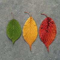
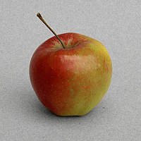
This apple reminds me of Isaac Newton, who originated a lot of our knowledge about colour. Would this "Pomme" be of the "Api" variety and be united to "Issac Newton", I would get the central motif of my trichromatic painting :
A Pomme (d'Api) for Isaac Newton.
Acrylics on linen on panel 80cmx80cm. April 2006.
James Clerk Maxwell, Mallarmé
Another of my heroes of colour thinking is James Clerk Maxwell, a contemporary of Hermann von Helmholtz. an elegant and clear writing serving a genial thinking.
For my next painting, I will do a double portrait joining Maxwell for scientific knowledge with Stéphane Mallarmé for the art of letters and words.
Interrestingly enough, with "James Clerk Maxwell" and "Stéphane Mallarmé", I choose two motifs whose colours are constituted only of a (black) and e (white). This will produce a grisaille image, whose title wil be (twice four syllabes) : "James Clerk Maxwell, Mallarmé". It so happens that "Maxwell, Stéphane Mallarmé" is chromatically equivalent.
The title being given, happened what Paul Valéry already described about one of his verses : my fragment behaved like a living fragment, since, immersed in the supposedly nutritive milieu of the desire and expectation of my thought , it proliferated and grew all he missed : a few verses above, and a lot below. Presto, I did compose an extension of the title :
James Clerk Maxwell, Mallarmé :
Le Sa -l'alea et le Ça,
C'est l'alphabet la clef de l'art;
La lettre, pas l'état d'âme.
This quatrain of octosyllabes makes two juxtaposed squares. Its colours (black and white) dispose themselves symetrically, each square being the negative of the other :
The text itself, with its metric and symetry, takes on an obvious plastic presence. Doggerel maybe, but they gave me en insight into what happens to poets who, with their rules of rhyme and metre, are dealing with pictural composition inside the text itself.
O Iris Pur Issu du Mot
From the minute work on the transitions between complementaries I got the idea of a treatment of colour at the edge of invisibility, near black. In a chaotic background from the series Voyages et Rencontres I limit the four tones to a thin fringe. The drawing can be just a play of red and green segments, which I superpose to an image of the natural transition between red and green in autumn foliage :

Les Couleurs se Ramassent à la Pelle IV.
Digital print 33x33cm. November 2009.
Another principle of composition of backgrounds at the edge of invisibility would take the four traditional "primaries" -red, yellow, green and blue- bnarely distinguisable from black.
A rainbow reduced to four colours, obtained through the observation in darkness of the projection of a slit of light through a prism.
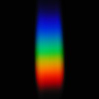
The background being a naturalistic figuration of the threshold apparition of colour in darkness, I would, like in other paintings, treat the central figure as a synaesthetic figuration of the background litterally described. So I choose a phrase made of letters of primary colours -i o u- describing the rainbow (Iris was its divine personnifacation in antiquity) and the birth of colour from the letter black as ink.
O iris pur issu du mot.
Acrylics on linen on panel 80cmx80cm. August 2009.
Du Mot Voir l'Iris sous l'Obscur
Very similar to the above, and expressing more or less the same thoughts, starts with a formal a priori : instead of combining red, yellow and blue, it invoques the intermediate hues -violet and orange.
Du mot voir l'iris sous l'obscur.
Acrylics on linen on panel 80cmx80cm. June 2010.
Rouge, Vert, Outremer, Safran
Those four words denotate the four primaries, with a degree of petic license.
Rouge, vert, outremer, safran.
Acrylics on linen on panel 80cmx80cm. Aout 2009.
Green Blue and Red Get Split from Black
Here again, an expression of colour issuing from darkness. The reminiscence of Goethe's Treatise on Colour is there, without any polemic intention.
Actually, the starting point was a pleasant lay-out of tints, and I set myself the challenge to fing it a litteral equivalent which would be both descriptive and synesthetically figurative.
That was simple. Here are a few examples which came to my mind :
Les purs chromas de gris à vert
But chroma is no french word.
Le gris avec les purs chromas
...is not worth much more.
Some are pure divagation, as far as descriptive relevance is concerned :
L'esprit voyage sur la mer
Les îlots sacrés du Maghreb
Le violet des lupanars
Les violettes du pacha
Vert, violet, le pur karma
Le pur objet d'esprit dada
L'esprit s'acharne sur l'objet
Le prix d'achat des pull-over
Those are not the worst examples; but they all correspond to the painting. For some unconscious reason, Les violettes du pacha insinuated itself as a proper designation of the apinting. But it did not give complete satisfaction.
In such a mental agony of the search for a title, I had recourse to the old medicine of sleep : you think thouroughly about the terms of your problem, then go to bed, and then the unconscious starts its work. In somme state intermediate between sleep and wakefulness maybe the solution will appear, which you must then quickly note on a piece of paper so you can retreive it when fully awake. On this fine morning of august 2010 this came to my mind :
Ah guine; teuf nitch tappoutch
ill. De Cramer, Missel Quotidien pour Enfants
Not really a statement of lightning cleverness; and a rather abstract sentence. That too will not make a satisfying description of the painting.
But, rather than searching laboriously in the universe of things said in french, would it not be better to explore for instancethe the worlds talked of in the english language ?
And indeed, there lied an eight feet verse with some relevance to the primary colours emerging from black :
Green blue and red get split from black.
Acrylics on linen on panel 80cmx80cm. August 2010
Now at the end of this series, I find myself in aposition inverse from the one I adopted at the beginning -to start with a title which would inspire unexpected colours and harmonies; I am now in the traditional scheme of a formal a priori ollowed by the search for a more or less redundant title. But on the way I experienced the similitude of pictural and poetic inventions.
