Chemin de Traverses
I S E L P, Galerie Découverte, Brussels.
From may 3 through july 26, 2003.
We choose here to present moments of divergence on a path whose coherence will still, it is hoped, be peceptible. 34 works on paper are shown, distributed in seven themes :
TIME.
The TRUE and the BEAUTIFUL
The COLOURS of SHAPES
CREATION and DECONSTRUCTION OF CHAOS
JEUX d'ECHIQUIERS
The REPUBLIC of COLOURS
SPACE

TIME
None of the images I showed in this exhibition could be seen as direct expression of time. In art time can only be introduced a posteriori, through a spatial arrangement of moments of esthetic insight.
The DIALECTIC of MARBLE and FABRIC
In The Story of Philosophy by Bryan Magee, I find a picture of St Peter in the Wardrobe, one of 52 churches built by Christopher Wren in London after the Great Fire of 1666.
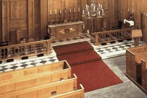
The detail of the altar delighted me with its aspect as an instant in a sort of dialectic of marble and carpet. Yet it seemed to me only fair to attempt to give more amplitude to this story and to expand in six acts.
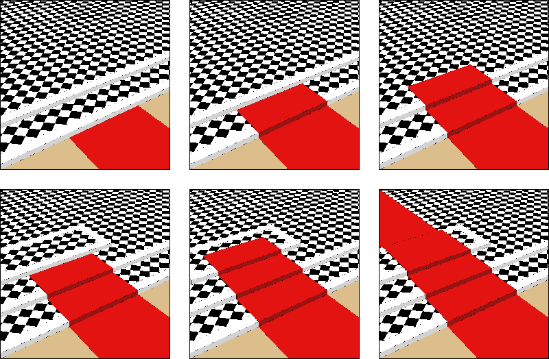
After a verification, it appears that this church would rather be St Andrew by the Wardrobe and that it does not exist anymore.
The METAPHOR of SCIENCE
In 1982, being, at the Atelier d'Architecture du Sart Tilman directed by Claude Strebelle, in charge of the conception of a central plazza for the new campus of the Université de Liège that would double as a covering slab for an parking garage and also be a symbol for academic ideals. These circumstances seemed ideal for an essay in architecture as ideological model, opting for an Kahnian and Aristotelician materialism. For a university whose scientific and secular advocation was clearly stated, I proposed that the central plazza should be thought of as a metaphor of science considered as the narrative unfolding of the tribulations of form as concept and image, and as a compromise between final cause and contingency. A drama in four acts :
 Observation of reality : the topography of the place
 Reservation of a 100m square of reality
 Geometrical representation, inaugural of techological interventions
 Start of a corruption, enrichment process of form with the laying out of ventilation exhausts.
Eventually the third stage was realized.
The POINT of DAWN
In 1999 sculptor Therese Chotteau entrusted to me the conception of a socle for a sculpture in Louvain-la-Neuve, Le Porteur d'Eau.
It was, on a sloping plane of blue marble and in the idiom of a strict geometry, the reinterpretation of her main motif, flow.
During the fabrication of a cardboard model, I photographed some intermediate stage which had the appearance of an opening door.
Looking for a title for this image, I found, in a chronological order :
Onde de Synthèse; Modèle n°9; Onde 004; Lourde; Le Poids des Ondes; La Pointe de
l'Onde; Le Socle de l'Eau; Une Onde s'ouvre; L'Onde Lourde; Le Jour de l'Huître; La Pointe de l'Huître.
Rather than making a choice, I juxtaposed four of these moments where the image in search for a label went through shifting visual meanings.
ANNUNCIATION (after Leonardo da Vinci).
Around 1475 Leonardo da Vinci painted an Annuntiation, now in the Uffizi museum in Florence.

On the angel's side the vegetal is represented with Leonardo's well known accuracy of observation; on the Virgin's side plants assume the stylized forms of conventional marble sculpture. Is this an Annunciation of the coming substitution of empirical science to mediaeval erudition ? The colors and the beautiful frontal composition, in the airy manner of da Vinci, inspired me a play of forms and colors superposed to the opposition of natural to artificial.

PENTECOST.
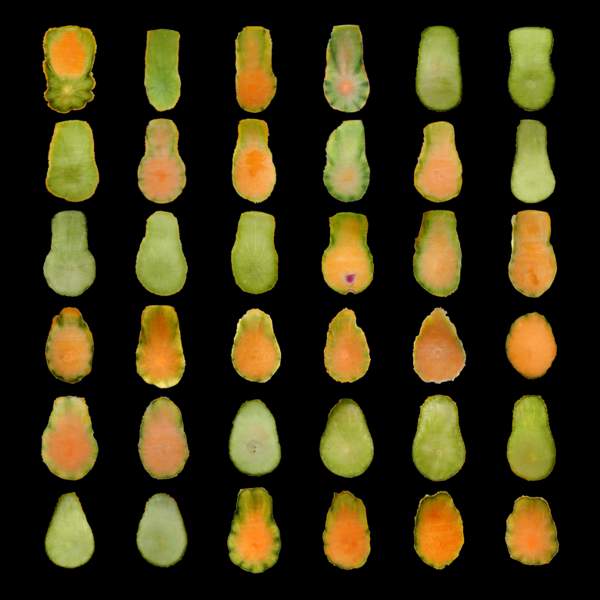
Nothing beats a fruit in the morning to prime the corporal plumbing and clear the eye. The summer of 2002 saw as a designated victim for that happy sacrifice the melon. Each morning between july 24 and september 21, I started the carving with a gesture, always the same, of ablation of skin fragment from the top toward the equator which bore the trace of a preliminary separation in two hemispheres.
Each time there was the discovery of an new distribution of greens and pinks in the melon's flesh. I immediately recorded each with my camera, under varying lighting conditions. The narrative inventory of these tongues of fire I called Pentecost.
The TRUE and the BEAUTIFUL
The spring of 2003 brought us ample subject of reflexion, anguish and indignation on the déliquescence of the republican sense of justice and truth in the great occidental democracies. Thousands of people were killed in Irak to satisfy appetites for power and wealth. Unavowable in their real motivations, these policies had to bend to the democratic rules by giving this war an ideological motivation, both as a moral crusade and -singularly- as a theatrical drama of truth and lie. One one side were supposed to stand the holders of good and true, against the axis of evil- and of deception. Time was not wasted to disqualify the procedures
to establish truth on empirical findings. This war, promoted by an alliance of fake intellectuals and real swindlers, has a distinctive post-modern cachet, war here being the continuation of silliness and arrogance by the means of violence.
What is an artist to do ? Would you let yourself be submerged by the feeling of impotence, maybe cynically celebrate the futility of art ? The game is not over, and even if the means of action seem very limited, we are none the less to measure our engagement to our destiny. Desultory as it may seem, our action will not gain in impact by being false.
And so, at my modest scale, I thought I had to assume the power of truth of the work of art, whatever its bearing may be. It is fundamentally correct to think in terms of ideological model rather than esthetical evasion ; we are faced with the requirement of discrimination between true and false, concept and image.
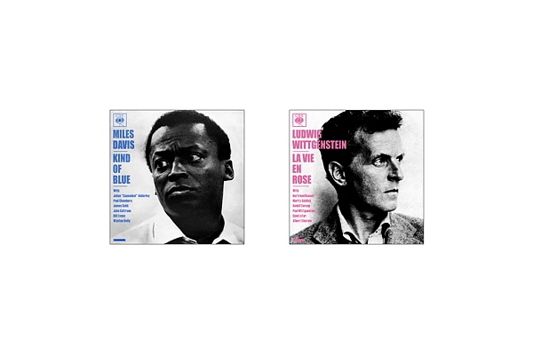
SELF-PORTRAIT of the ARTIST as 'THIERRY GONZE' (the Beautiful)
In Synesthesia, the Colours of Shapes, a series de paintings and text of 2001, I applied myself to the production of compositions of colors, minimal in their starting hypothesis : the aim is not retinian gratification, but rather a relationship to an non-pictorial reality : a paradoxical figuration. Not the imaginary projection of a subject on the plane of the painting, possibly enriched with painterly effects, but a quest for an Other in a litterary reality : the name of the thing, and its letter laid out in syllabes. All this happening in a mental place where no naturalistic nor symbolic determination would hold sway. The letter assumes a color through the effect of a synesthetic perception; this color results of the proximity of vowels and consonants, each color standing for a syllabe of the word. The space of the painting is divided in as many syllabes (and thus of colors) as there are in the name. The design is most elementary : taking as subjects for my paintings names of four syllabes, I simply laid out four square expanses of color : two lines of two syllabes, first name and name.
To make clear that any attemps to find here information or enlightenment of a figurative nature, the only formal cause in action here being some obscure and absolutely personal mental phenomenon of mine, I
called these -a bit provocatively- selfportraits. Neither shoud one see here a eruption of narcissism : this mental association of synesthesia is only a readily available impersonal subject-matter, in the spirit of Paul Valery's impersonal introstection of Monsieur Teste.
To truth I owe to admit that the effects of seduction of the form as image persisted even after all these precautions to avoid them. For instance the colored rendition of my name - which stood as signature on the cover of the text- repeated the scheme of other name-paintings done before: names of four syllabes which produced a nice minimalist composition.
The result would have been true to the principles if my name had been something like Terry Gonze.But here I had something nice but a bit false.
SELF-PORTRAIT of the ARTIST as THIERRY GONZE (the True)
For synesthetic figuration, the first syllabe of my name did not confuse in space the colors of the i and the e. Actually, the syllab Thie should rather have been treated as two tints, and the first name becomes a suite of three colors. The symetry of the painting is thus ruined, but the accuracy to the subject more faithful : this representation must be considered as the true one, and the other be discarded as a fallacious embellishment of reality.
CHESS-BOARDS : the TRUE and the BEAUTIFUL.
Wanting to use in another composition the motif of the chess-board, I enquired with an expert about the regular disposition of the black and white squares. He assured me that the board had to be positioned with a black square in the lower right corner.
When the painting was done, I had a doubt, and a more extensive verification revealed that the chess-board had been erroneously figured.
I did not want to throw the painting right away, and searched for a way to convert it into a exact image of a regular reality. The most economical solution was to shift the squares one step to the right or the left. I thus produced a true image, but at the cost of symetry.
I was then left with a regret not to have done the painting both accurate and symetrical as I first intended to, and so I decided to do a second version. I have now two paintings, the nice and the true.

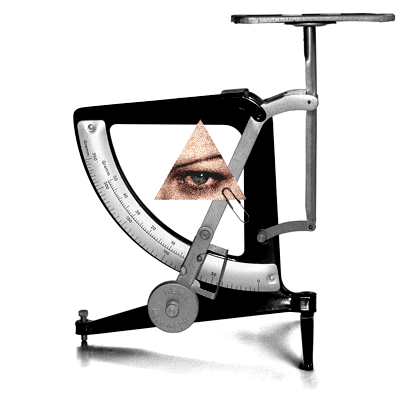
Is IS IS?
The advent of deception in American public life should not be dated to the inthronisation of the lesser Bush. Bill Clinton already was an natural for logical sleight of hand. The continuity is well illustrated by Michael Moore in Stupid White Men : Hey, who wouldn't want to join a belief system that redefined words like is ? It is about Clinton's quibbles during the enquiry on his relationship with Monica Lewinsky.
Somehow I then thought about Magritte's image where an image of a pipe is underscored by the sentence This is not a pipe. Of course Magritte wants here to draw our attention to the difference between image and concept, and the risk of confusion inherent to painting, and I can only subscribe to that program.
I replaced the pipe with something which is not a cigar and is extracted from Magritte's La Légende Dorée, which shows a squadron of baguettes in the night sky.
Back to the matter of truth and image, and the politics of deception. A revealing moment was Colin Powell's speech at the U.N., which made us well understand that images and things can bear any meaning forced upon them.

INSPIRATIONAL LANDSCAPE.
Most unsettling, in the latest usurpation of power by the american extreme-right, is the quasi systematic inversion of traditional values. From now on brutality and silliness are valorized. The medias have informed us to saturation on the jubilation of G.W. Bush when he proclaims to his compatriots that he is proof that any fool can become president. Exactly this inversion of value is the common character between this regime and nazi Germany.
The ideal artist for this retrograde regime would certainly much resemble Thomas Kinkade,
"America's most collected living artist", whose opus can be seen and bought on www.thomaskinkade.com. No internet site embodies like this one the lucrative union of bigotry and bad taste.
I could not here adequately evoke the vulgarity of these daubs. They seem to need a text to exist, so the public may know how lofty this art pretends to be. I reproduce here the caption for Perseverance :
Thunder crashes, sails billow, waves toss the fragile boat. We see that the clouds are about to break. The sea will calm; the sailor's perseverance will soon be rewarded by a return to God's safe heaven. Perhaps this painting can assure each of us that if we can simply persevere, God's hand of love will soon disperse each storm.

Certainly the text here is the operative factor. For the image, I chose one which adresses frankly the bellicose exaltation and idyllic naturalism of the text.
The COLOURS of SHAPES
In a text and a series of paintings entitled 'Synesthesia, the Colours of Shapes', I ventured into a systematic exploration of the phenomenon of mental adherences between perceptions of colors and perceptions that belong to other image-making faculties . In fact, this amounts to a grounding of drawing and coloring on another basis than the figuration of a subjective interiority or than the eclecticist manipulation of conventional pictorial signs.
The COLOURS of VOWELS.
The moment of my childhood when I discovered that synesthesia aroused a lively interest in other people was when at school we were introduced to Rimbaud's sonnet "Voyelles", of which the first two lines are :
A noir, E blanc, I rouge, U vert, O bleu: voyelles,
Je dirai quelque jour vos naissances latentes ...
Je remarquais que ces couleurs n'étaient pas celles que j'associais aux lettres. Pour moi, le sonnet aurait eu pour premier vers :
A noir, E blanc, O rouge, U jaune, I bleu: voyelles, ...
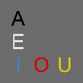
Of course I understood that Rimbaud could not be wrong, and neither was I. Contrary to ideas promoted by some romantic and modernist theoricians (most notably Kandinsky), synesthesia cannot be taken as a blueprint for a universal plastic language. The phenomenon is strictly personal.
The drawing I showed contrasted this motif with a background were the colours are an imitative representation of nature :
The COLOURS of CIPHERS (Zéro)
Numerals also have -for me- their synesthetic colours. For the first five we obtain the following lay-out :
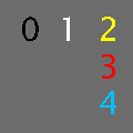
This motif again is contrasted with nature as camouflage as mimetic rendering of nature.
The COLOURS of THINGS.
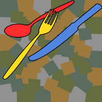
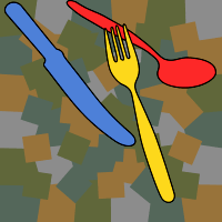
As an illustration of other synesthetic determinations of form, not limited to elementary abstract forms, I wanted to make a proposal with a figurative aspect : synesthesia is not based on the pictorial form, but on the shape and nature of a represented object.
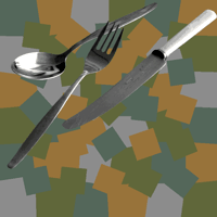 The knife is blue ; the spoon is red ; the fork is yellow.
No poetic effect here attuned to the pictured thing, whether heroic, tragic, moving or otherwise sublime. The chosen theme is most ordinary. The sense is created in the relationships between the different elements of the image.
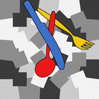
 SYNESTHETIC STILL LIFE
 The TASTE of COLOURS
 About TASTE and COLOURS
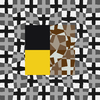
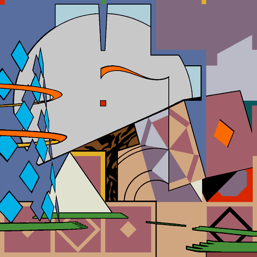
CREATION and DECONSTRUCTION of CHAOS
Most of these synesthetic compositions return to the traditional duality of figure and background. For the background I invert the relationships between mimetism and abstraction which characterize the synesthetic figure :
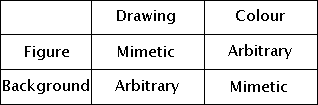
We find that it is a transposition of the traditional contrast of the landscape to the figure. Landscape here becomes camouflage, a chaotic pattern whose construction (because of my classical bearings) conforms to pictorial constraints of economy of means and confinement in the universe of the canvas. Pages 16-42 of the text " Synesthésies, la Color des Formes " explicitate this aspect of my work.
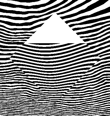
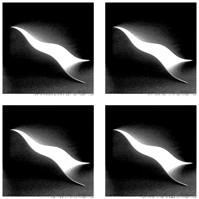
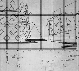
The CREATION of CHAOS (2d moment)
The design derives from a superimposition of two patterns : one is a matrix of squares diversely rotated and the other a distorted grid. The rotations of the squares and the displacements of the grid's nodes are nul at the edges and increase toward the center. The numerical values of these perturbations are derived from peculiar matrices called magical squares.
For instance, a chaotic pattern with five elements on the side is obtained thus :

The drawing exhibited and reproduced on the invitation reproduce the scheme top-right, but with 6 elements to the side :

Before the selection of colours for the Camouflages I wanted to test the effect with hatch patterns. Two prints corresponding to six and seven modules per side were exhibited :
 DISCRETE CAMOUFLAGE (mod6)
Reproduced here is the upper-left quarter of the whole.
 DISCRETE CAMOUFLAGE (mod7).
Reproduced here is the upper-left quarter of the whole.
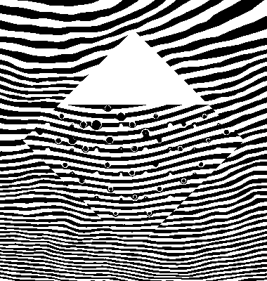
The DECONSTRUCTION of CHAOS
 The DISSIPATION of the MAGICAL SQUARE
For a yet unfinished research in the direction of subtler colors in a more ambivalent pattern, I try to weaken the design through different devices. For instance by disturbing it with curved lines that are both alien to the original geometry and laid out from the same matrices of numbers -magical squares- used for the chaotic patterns.
Reproduced here is the upper-right quarter of the whole.
 The DECOMPOSITION of CHAOS
Another device for a weakening of the drawing is the superimposition of two chaotic camouflages of the same module, same distribution of colors, but slignly different drawing, obtained by two different magical squares. In this case the module is seven.
Reproduced here is the upper-leftt quarter of the whole.
 The SUBLIMATION of CHAOS
Through boolean (logical/arithmetical) operations on the digital representations of colors I produce here two sorts of deconstructions of the pattern.
Reproduced here is the upper-left quarter of the whole.
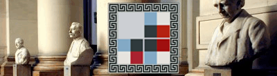
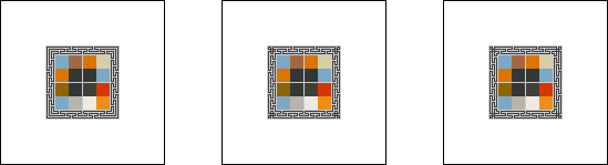
PLAYING with CHESSBOARDS.
In a series of paintings which extends the play on the colors of names by making the painting a combination of two names, I take as a subject the name Marcel Duchamp combined with one of Duchamp's aliases as a punster, Marchand du Sel. These names are combined according to the arrangement of a black and white pattern which gives both a matrix for the distribution of colors and a background for the figure of names. In the case of Marcel Duchamp, a chess-board pattern seems most appropriate. One variant builds the pattern in perspective. In another I try to transpose the chequer-pattern in the chaotic geometry which I elaborated for the Camouflages.
It is obtained by the combination of a matrix of squares and a grid, each distorted according to the rule of the magical square, and expressed in black and white.

This distribution of four greys can then be used as a matrix for the painting, where the appropriate amounts of the colours of the names are substituted to the greys.
Some of those substitutions, applied to a matrix named EQ89R1 were exhibited :
 DISTURBED and RECOMBINED CHESS-BOARD (aspect wwkk)
 DISTURBED and RECOMBINED CHESS-BOARD (aspect wwvr)
 DISTURBED and RECOMBINED CHESS-BOARD (aspect wwkw)
 DISTURBED and RECOMBINED CHESS-BOARD (aspect wkwk)
The REPUBLIC of COLOURS
For an exhibition organized in the spring of 2002 to honour one hundred years of action of the Ligue des Droits de l'Homme, I proposed a reflexion through text and images which generally expressed a distrust toward all imaginary identifications, howerver well-intentioned and politically correct they might be.
The painting shown in the Palais de Justice of Brussels united heavy historical names such as 'Fidel Castro', 'Dziga Vertov', 'Adolf Hitler' in one synesthetic composition. The message is that although all art should ultimately be judged on its political merits, these should not be understood in simplicistic terms counfounding image and word, image and reality.
A later proposal on the same principles groups four names associated with the Chinese revolution. For the Chemin de Traverses exhibition I chose to show three preliminary studies :
The Republic of the Middle. Self-portraits as Kiong Houa, Chou En Lai, Tchang Kai Chek, Mao Tse Toung.
Dim: 30x30cm. Acrylic and digital print on Canson paper, may'2002.
Shown here also were prints of the images included in the text 'La République des Couleurs'.
The Weight of Souls.
Giclée print on watercolor Arches paper, march'02, 27,5x27,5cm.
Le Rose et le Noir.
Giclée print on watercolor Arches paper, march'02, 36x24cm. 6ex.
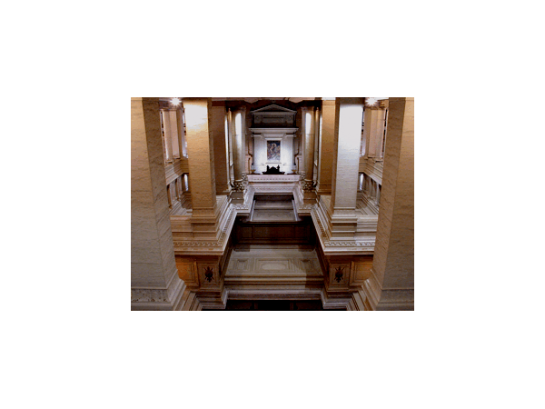
The Tomb of Justice in Brussels.
Giclée print on watercolor Arches paper, march'02, 55x42,5cm.
SPACE
The medium of modern architecture was space, an enigmatic substance which seemed not to be reductible to any common experience and whose metaphysical distillation by theorician helped give it an air of mystification. Vitruvius never spoke of the stuff, and the parthenon was very well made without any thought given to it by Ictinos or Pericles. But its inexistence as a real substance does not make it inexistent as a cultural, historical and ideological notion.
Pictorial space similarly, as long as it is not subsumed as a real substance, can reasonably be talked about, as a nominalist suitcase-notion. the objet of art may be the play with the ambiguities and role permutations between pictorial, perspective, and textual spaces.
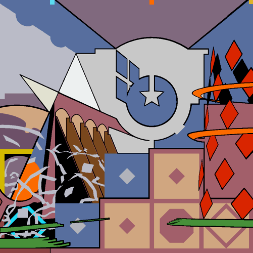
MIES in ORBIT, with PALLADIO
Gravity is a medium of which architecture is so thoroughly soaked that we cannot readily apprehend its effects. I wanted to construct an hyporthetical model where, gravity taken out, its effects on other Vitruvian values -like symetry- would be revealed. Space here is defined as both what lies outside our gravitosphere and as the field of architectonic relationships. The rules of agglutination of forms through symetrical opposition will then assume a very different figure.
I saw no reason not to telescope two well-known vitruvian classicisms : Palladio's at the Villa Malcontenta, and Mies van der Rohe's hyaline and modulated crystals.
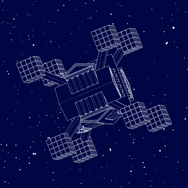
MIES in ORBIT, with PALLADIO. Argentic print, 40x40cm, may'2002. 8ex. Partial reproduction.
SANTA's CONVERTIBLE. Working drawing
Before they are reported on canvas, my compositions were digital drawings. Such a drawing of 1988 provides a dialogue between the space of the drawing and the textual space.

The IDEAL CITY.
French art critic Jacques Mesnil, in l'Art au Nord et au Sud des Alpes, showed that in the 15th century, Flemish and Italians alike mastered the principles of perpective, but used them to suit their different cultural temperaments. What distinguished the Italians was that their perpective delineated a unitary space, very dissimilar from the assemblage of discrete spaces set up by the Flemish. It was more advanced in that it heralded the birth of space as universal receptacle, and not qualitative or narrative aggregate.
A little painting of the Quattrocento attributed to Piero della Francesca, and which stands in the Palazzo Ducale of Urbino, gives an excellent insight in this attempt to unify space.
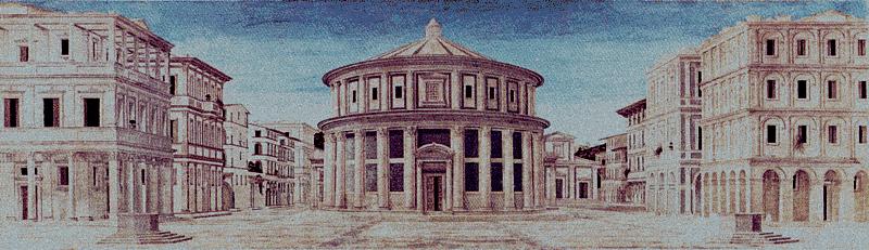
From an image in perspective such as this Ideal City, one can, through a sort of reverse engineering, reconstitute the parametres of vision; locate, relative to the plane of the canvas, the eye of the observer and each of the represented objects, inasmuch as one admits that those objects are reasonably constituted (i.e. essentially with square angles and euclidean volumes). My own composition, after a careful computation of the parametres of vision, takes back some elements of this urban landscape and submits them to transformative operations between the plane of the painting and the perspective space.
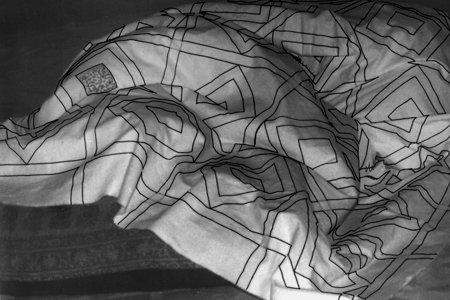
Architectural volumes are converted in 2-D outlines, more or less arbitrarily stylized. The 2-D pattern of the pavement in Piero's painting stands in the plane of my canvas as a 2-step grid, a familiar compositional device for architects.
Some patterns reappear as supergraphics on the planes of volumes represented in perspective. The same pattern of the pavement, transferred on the irregular surface of a quilt on a bed, is again projected as an object in space.
To sum up, would not the ideal city be the result of an urbanism of contradictions and ambiguities between the diverses modalities of our imaginary and symbolic representations ?
Organisation : Institut Supérieur pour l'Etude du Langage Plastique. Boulevard de Waterloo 31, 1000 Bruxelles.